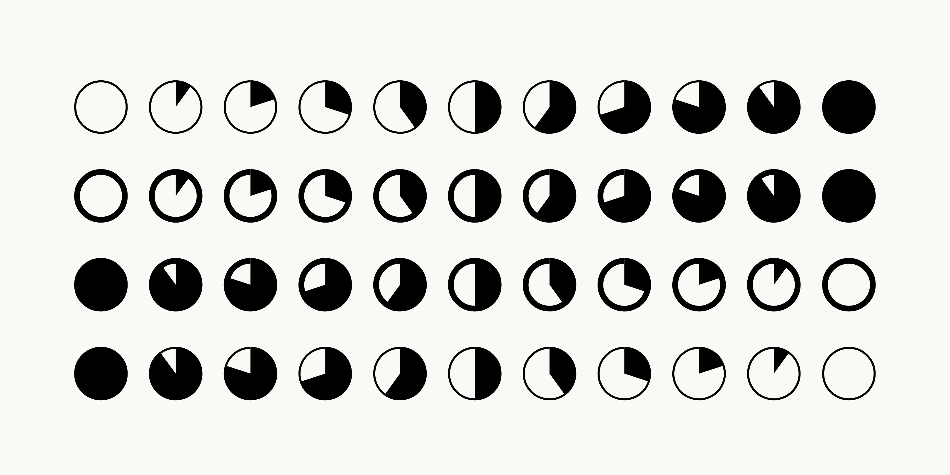
Every charting library ever written answers the same question: how do I get a picture into this paragraph? Datatype answers a different one — what if the paragraph could just draw it.
Type {b:15,45,80,30,60} into a text field set in Datatype and OpenType ligature substitution replaces the whole expression with a five-bar chart, sitting on the baseline where the characters were. {l:2,5,3,8,1,6,4} gives a sparkline. {p:62} gives a pie filled 62 per cent of the way round. Up to twenty values per chart, each between 0 and 100, and that is the entire API.
The consequences are the good part. A chart made of glyphs is text: it inherits its colour from color, its size from font-size, and it selects, copies and pastes as the source expression. Set the ordinary variable axes — weight from 100 to 900, width from 50 to 150 — and the bars thicken and the pies gain a heavier stroke along with everything else on the line, because the renderer has no idea it is drawing data. Nothing to hydrate, nothing to resize on rotation, no second network request. It works in Word and Figma as readily as in a browser, which no JavaScript chart does.
Frank Tisellano designed and built it, with guidance credited to Emma Marichal and Dave Lab6. It is released under the SIL Open Font License, version 1.1 — install the TTFs to a system fonts folder, or link the WOFF2 with @font-face.
The limits are real and worth stating before you plan around it. Twenty points is a sparkline, not a time series. Values must be normalised to 0–100 yourself, so the font will never draw an axis, a label, a legend or a tick — it has no idea what your numbers mean. And the whole thing rests on ligature support being switched on, which is default in browsers and in most design tools but is exactly the setting some applications quietly disable. When it fails, it fails visibly: you get {b:15,45,80} in the middle of your sentence.
Which is the honest framing. This is not a replacement for a charting library; it is a replacement for the sentence “revenue grew slightly, then fell.” Put the shape in the line and the reader gets it without a caption.